Mapping: Barbara Macfarlane, NYC
In the summer of 2012 Barbara was asked to submit work for "Londinium" a mixed exhibition at Rebecca Hossack Gallery in London to celebrate the city as host of the Olympics. Barbara exhibited 3 large paintings which were based on a map from 1588 by William Smith which combines a profile view with a perspective view. Her painting like the original was full of red rooves and church spires. This was the beginning of a new development in Barbara's work.
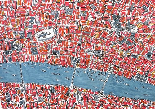
She began investigating antique maps from the 18th and 19th centuries and has used these as starting points for her new work. Edward Weller's map of central London in 1862 for example was the inspiration for her Red London series. These paintings are a maze of rich reds and oranges cut through with the calm blue line of the river Thames.
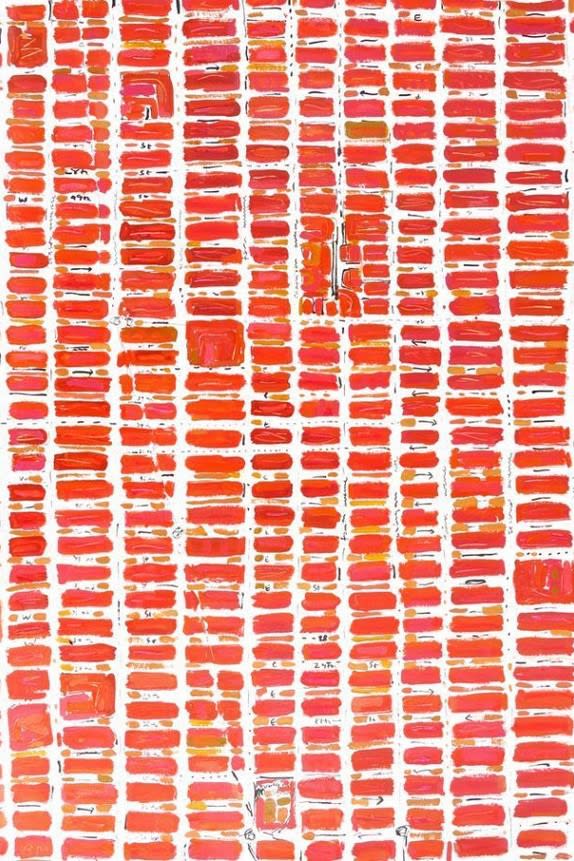
In Barbara's maps of Manhattan, although she uses "straight" lines, the drawn marks of the streets are free giving the work an energy and vibrancy which relate to all her other work. The colours of each map are rich yet subtle.
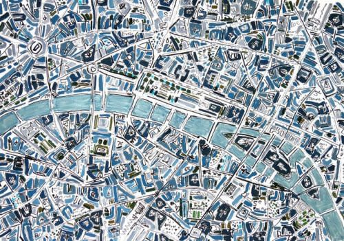
Her new series of Paris maps are based on a Time Life map from the 1950s. The shape of the Seine, the Ile de La Cite, the streets, avenues and arrondissements that we are so familiar with are painted in colours which evoke Paris: deep blues and greys of the lead rooves, with dark greens of the shutters and coffee cups, and the pale colour of warm stone.
Barbara's work is always very much about the painting rather than the map itself. Her considered use of colour and the quality of the painted marks relates directly back to her landscapes and seascapes. These paintings are filled with energetic lines which are drawn in ink with a stick. But unlike her landscape paintings these are filled with complex patterns of bright and intense colours. Through her use of mark making and juxtaposition of colours her paintings continue to seem effortless and free.


